Better Facilities
IA,UX - Client: GLL
I worked with Better Facilities to update their search matrix on the public web platform to create a continuous experience for their visitors and members.
Since it was a web app, it was designed responsively and it was also considered that should be ready for further expansions (such as new areas and facilities) may be added in near future. In the end, we made it better - pun times!
Where to begin?
The initial question was "how we can create a continuous search function that would let users navigate easy and quick?". Our start point was a global search with high-level items to select. The target age group is from 16 to 60 so we didn't want to introduce something more complicated that might alienate existing members.

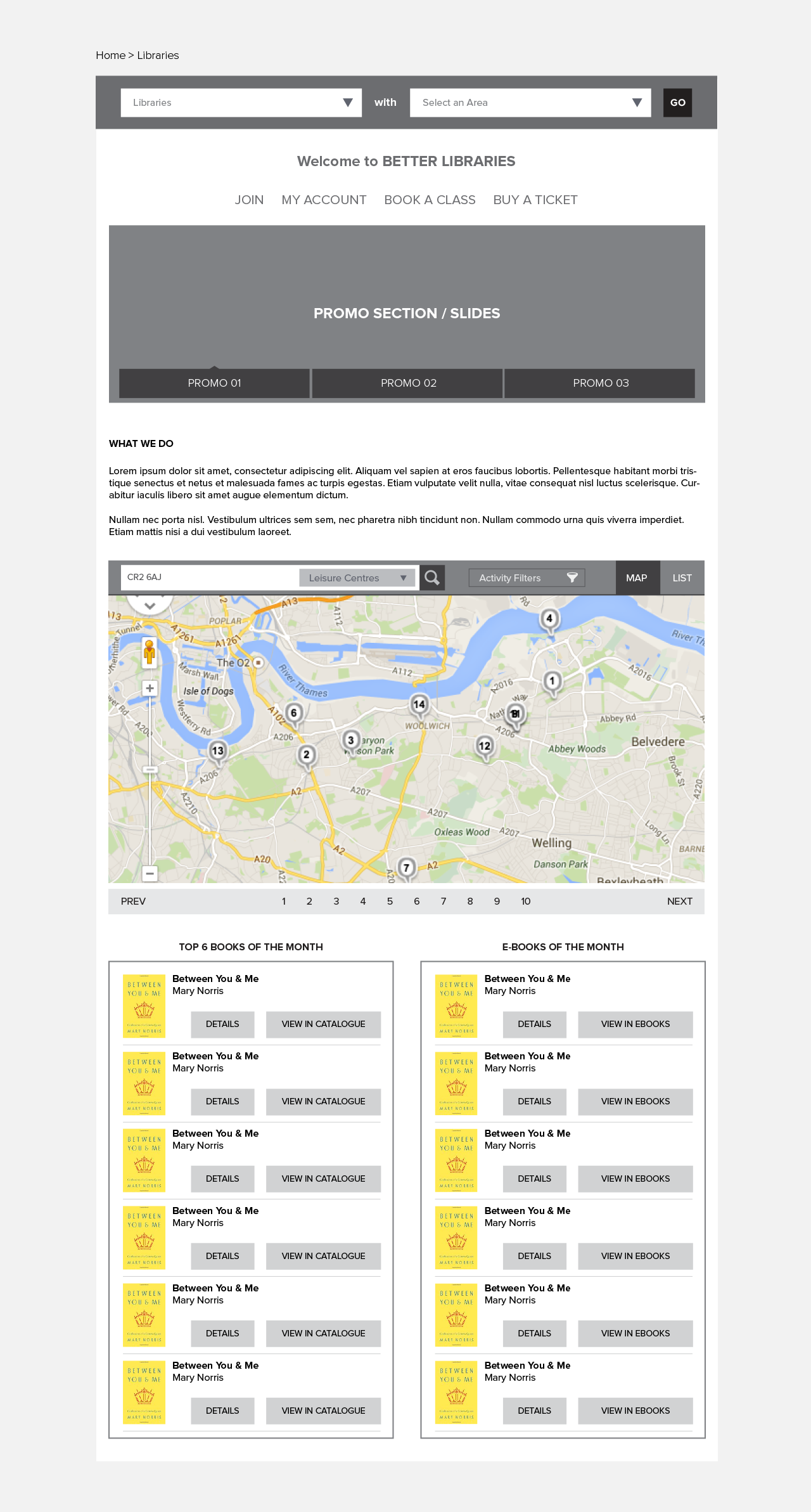
Focused search on selected areas
In this sample journey, the user selects a specific area to view refined information specific to the selected area. These pages are basically microsites that are edited by each Area team and it has its own News, Promotions, Community bulletin and other Area specific events.
Below, we used the same search with a different visualisation: map and list view. So users can make a new search to jump to another area or can focus on the current selection by making micro searches on the map and also can see the list view on facilities in that specific area.

Contextual Search options
It was obvious that adding a new filter after every step (making a search in this instance) would be confusing. Users may start the search by selecting an area or facility. The solution was using the same style for filtering and updating the search field based on which section the user is on.

What about that map search thing?
Once a facility is selected that current view flips back to show details of the selected list item, it is a card style, basically.
Regardless of what page the user is on, they always have this map option available. It still does the same job that global search does in a bit different style since we combined it with a map view. Plus, there is a list view that all the facilities with filtering options available.

It is all about choices
The following screen shows the journey in which the user selects a facility first and start the journey from there. It was another CMS controlled page so I designed a simple view for content that they already had in their existing backend.
Journey continues...
On the previous screen, the user makes a search for libraries and now the search gets narrowed; to a library in a specific area. It is exactly the same result which was covered in the previous journey so we almost achieved to create a continuous journey.