D / RACING
Dashboard Designs - UI & UX - Client: IBM IX

Getting Started
I worked on UX and UI, also on the art direction with the client. I asked tons of questions, learnt how this should work and started on initial designs, even skipping wireframing!
When I started on this dashboard project, I had limited resources such as Excel files and written documents with several restrictions. In another saying, I was supposed to create the most efficient data visualisation to give users every single detail available before and during the race.

▲ On the initial screen, team members can see all drivers take a place in the next race (and also during the race). On the bottom, the timeline shows which day the data is available with a subtle comparison (ups and downs) for each driver. A team member only can see their own drivers which is indicated with a label on the top left.
Other initial options are placed around the focus area. These options are selector for Season, Race for that specific season, List and Graph views for presented data, if available. And as the main navigation, we have Leaderboard, My Drivers and Global View. My Drivers is an alternative option to access specific team drivers.
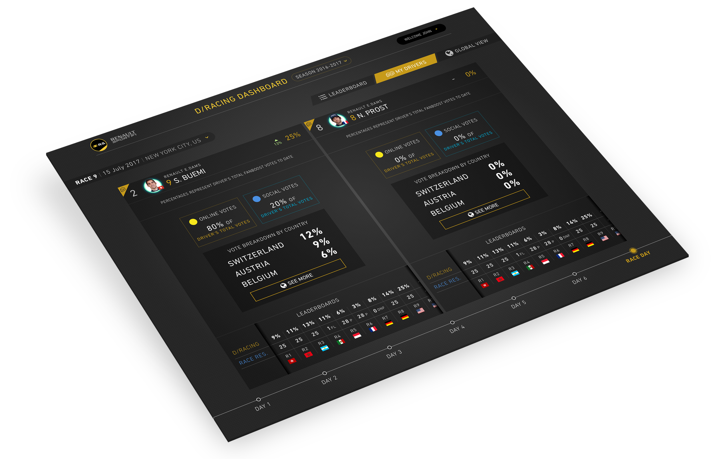
▲ Once a driver is selected, this is the screen a team member will have. Since there are always two drivers per team, I placed them side by side to make the data available for comparison and easy follow up rather than creating an extra step.
For each driver, team members have a simple breakdown for Online and Social votes, details for country-based votes and race results and points for the actual race and social voting scores.

▲ If a team member wants to see a more detailed view of country breakdown for their drivers' votes, this is the screen they look at. With simple navigation (considering it may be a desktop or tablet) they can click/tap on the map between indicated (blinking dots) areas to see where do votes come from.
The bigger circles get, the more votes it means. So team members can see where they are doing a good job on social media and they can focus on wherever they would like to get more votes!
Asset Management

▲ Since we didn't have access to existing assets, I recreated every single element by following styles from the Formula-E website. Then I added bits and pieces like background textures, gradients and small hover/tap states - essentials really.
And the good thing is, every single thing we created as an asset was used on FanBoost website design as well. I ended up having a nice, tidy symbol library in Sketch.
There is more on this project (a responsive website), please give me a shout if you want to know more.