HSBC Illustration Toolkit
UI and Illustration - HSBC

TLDR
For HSBC WPB, I’ve done these below:
Introduced a comprehensive Illustration Toolkit and Guidelines
Designed the entire illustration library and assets
Established a streamlined illustration review process for designers and products.
My Role
In 2021, HSBC underwent a substantial facelift in its branding, making improvements in photography, signature hexagons, and illustrations. The illustration aspect saw a significant shift from the previous line-art, monochrome style to a more lively and stylized look and feel.
We wanted to make sure that any illustrations to be created should fit into the new style, and to do that we needed to provide the necessary tools to our designers.
My role was developing a design system to help designers create illustrations by providing comprehensive guidelines, a toolkit, and an illustration gallery that should give them a starting point.
In 6 months, I designed a brand new illustration toolkit and guidelines, an asset library that includes ready-to-use illustrations and a review process that helps designers get their work into production.

Some library elements from the toolkit.
Let’s have a look at the sections in the toolkit
Where to Use
Since HSBC is a photography-first brand, we wanted to make it clear where and how to use illustrations. To do that, we talked about the placement of illustrations in the user journey, the difference between imagery and illustrations and how to be selective on usage so the content does not get saturated with illustrations.
Since the section about the usage, it was the ideal space to add "Frequently Asked Questions". Before going into the detailed section of the toolkit, the designer can look at this high-level information about how, where and when to use illustrations in the same section.

A simplified guide shows usage of illustration in a user journey.

We included numerous questions about the illustrations in general in the FAQ section.
Colours
The star of the toolkit is the colours since this is the first time we have introduced them in our illustrations. Each colour comes with both HEX and RGB values to help you convert these between each other. We keep our signature HSBC Red as a primary focus colour and use other colours with accessibility considerations in mind.
The guidelines provide clear instructions on utilizing the brand's dominant red colour and offer alternatives if the red appears too intense for a particular context. For instance, it outlines how to incorporate greys as an alternative and explains their synergy with the red.

Adding examples on what to do and what not to do is always useful for your designers.
Background
We aimed to create a distinctive look and feel to our illustrations by utilising HSBC's signature hexagon. Using it as a frame and a mask source adds a unique touch, creating a visual effect where elements within the scene appear on different planes.
The background section is about how to use the hexagon with the right balance whether in its full form or cropped version. Of course, the usage of the hexagon is not limited by these examples but it is a practical starting point for designers.


Using hexagons on a background plane.
Composition
In the composition section, we talk about the layout and the benefits of keeping it simple. Also, the shape language is about creating your elements by using primitive shapes and yet having easy-to-scan design pieces. We want to encourage the designers to move from Abstract to more life-like or real-life compositions to create a more "human" approach to their designs.
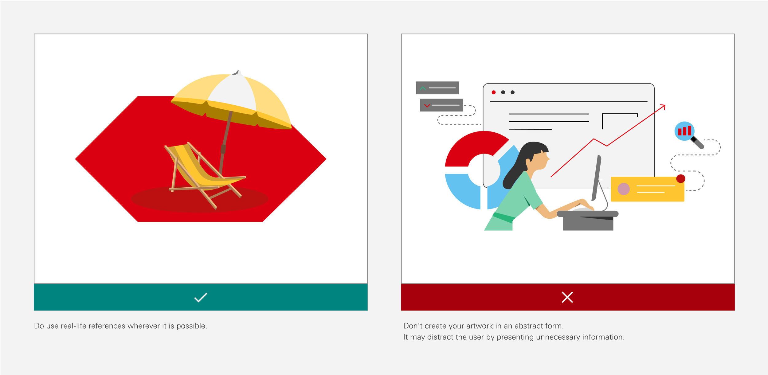
Difference between with real-life scenes and abstract compositions.
One of the issues we've had in the past was about keeping the right balance within illustrations. Since it is possible to convey the message without getting into too much detail, we wanted to share some basic rules about how to use the focal points in compositions and how to create a balanced visual in a few simple steps.

Even it is just basics, providing examples, like demonstrating how to create a balanced illustration, proves valuable for designers who may be new to the world of illustration.
Art Style
While many illustration guidelines mention these basics, we go a step further by providing some practical examples to demonstrate their effective application.
The Art Style section includes how to use basic drawing elements such as angles, rounded forms, and even border properties. Although we moved from line art to solid style, designers can use lines and strokes to add details to their creations.


Example illustration shows that how to create an object by using primitive shapes.
Shadows
To add a touch of dimension to illustrations, elements like shadows can provide a simple yet effective solution. I've outlined clear rules explaining how a light source behaves from different angles and guided using shades and tints to apply these principles effectively to cubic, spherical, and more complex shapes.

Additionally, "cast shadows" are introduced if there is an instance where the illustrated elements might need to be “grounded” .

Dimensions
Building on this, we looked into basic camera angles to diversify the visual presentation, breaking away from the monotony of a consistent front-view perspective. To keep it simple though, we currently offer front, top, and side views as the available options.
Within the colour palette, we've got shades and tints for each base colour. These values serve as valuable tools for emulating three-dimensional objects, explored through both cubical and spherical forms. We often refer it to “faux 3D” or “2.5D” effect.

Examples show how to add dimensions to object in different geometry.

A couple of illustrations from the top-view camera angle.
Masking
Illustrations can be used in their entirety or partial forms within the hexagon, essentially using it as a container. This approach offers a dynamic and flexible option by having elements of cropping and masking.

Using the HSBC’s signature hexagon as a base frame.
Library Elements
We aimed to assemble a library that big enough to provide designers with ample resources to kickstart their creations. Initially, we established categories like "Digital devices," "Avatars and Profiles," and "Objects," progressively expanding the library over the next months.
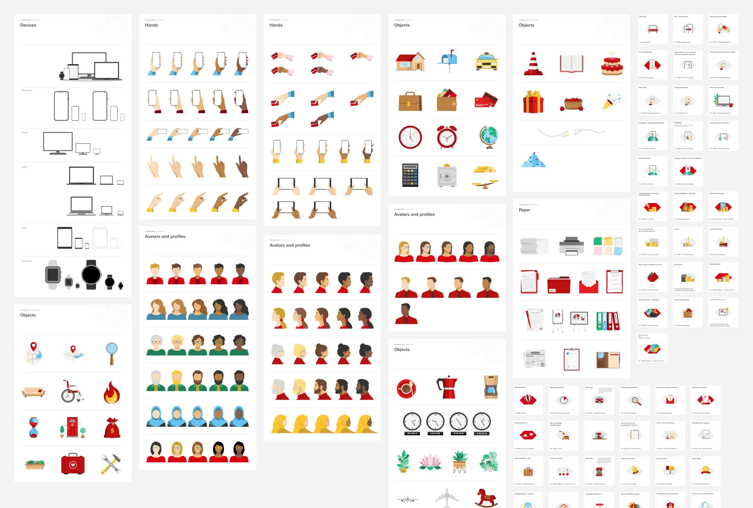
Collection of some of the illustrations created for designers to use.
To streamline the workflow, each library creation was converted into a Figma component. These components are readily accessible through Figma's search function, allowing designers to easily locate items. Moreover, each illustration comes with relevant tags, allowing quick searches for specific subjects.

Each component comes with a set of tags that helps them show up through the search.
Next Steps
The Illustration Toolkit is an organic work. It is getting bigger and better with every illustration creation by our designers and illustrators. We've been using its structure and DNA to create our very first motion toolkit now.
Please see the illustration toolkit as a Figma presentation in the link below.